It’s In the Details
An Elemental Approach to Marketing Communication and Novel Design
Considering Elements in Marketing
For writers and publishers, seemingly small choices in the production of a novel can help more to connect to your audience. The overall advertisements and strategies you use for yourself, or your clients, do make a difference in sales; however, consider how minute details will affect how an audience perceives the work.
The elemental details should be considered not only in the communication method chosen to reach the audience but also in the design and layout of the novel. What an audience first sees, the cover matters just as much as what delivers it to them.
Elements in Novel Design
The foundation of branding begins - not only by knowing how you want your audience to view you, as an author or the company that publishes, but through the design of the novel. It is important that you understand this is sometimes the first thing the buyer will see. It will not be through recognition from your name alone but from what is seen displayed on shelves and in digital stores. Keep in mind elements like typography, color, imagery, and tone when in design creation.
In Action
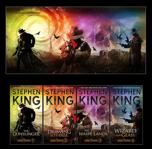
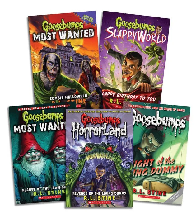
The words displayed on the cover and within are more than just a font. It works to signal to the audience the tone and context of the novel. Take two series like Goosebumps and The Dark Tower, both fall within the genre horror but based on the cover you can tell the marketing for each audience was different. Goosebumps is aimed towards children. The font is unique hand-drawn the words appearing to drip from the page and the tone suggests something spooky rather than chilling will emerge from the book. The series title is in various colored fonts to mesh well with the brightly colored images on the cover. The images that resemble illustration coupled with the bright font, appeal to a younger audience. The tone of the design conveys youth, mystery and draws children in with intrigue. The Dark Tower also has imagery that is illustrated however unlike Goosebumps the covers have more adult undertones, the colors less bright and the font more reserved. It is not the cartoonish Halloween coded cover that implies horror but instead the thin gothic font and the illustration of a lone cowboy and dark birds implies solitude and death. It also demonstrates that this work is aimed towards adults. A firm grasp on how the smaller elements of design work towards branding will help you in marketing your work towards your audience.